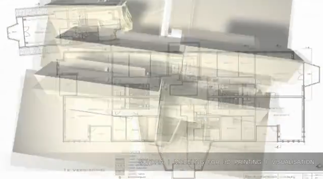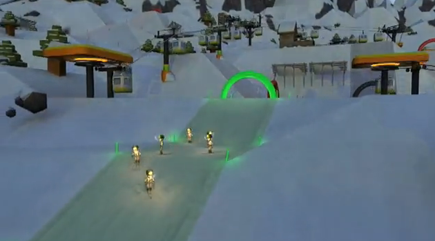


Interesting concept. Since the two freelancers from 1stfloor and IS3D started working together often they decided to create a combo reel. The result ist a solid demo reel. I just would leave at the info bar at the bottom. Even with the dark shadow the text is pretty difficult to read. Furthermore you want the viewer to concentrate on your skills and no trying to decode the info text. I would kick out the last screen with the head ‘make cool shit’… the second website is: www.the1stfloor.net
No TweetBacks yet. (Be the first to Tweet this post)


Neat animation pieces. The intro is a little weird though and some of the pieces look a little unfinished.
hey tom
your definitely right. It’s difficult to understand that those two names on the stone represent the artists. Perhaps a nice ‘come together’ style like animation would be better to tell the story behind this duo reel.
Neat animation pieces. The intro is a little weird though and some of the pieces look a little unfinished.